Charts
Charts are the building blocks of a virtual interface. They are live — they update automatically as the underlying data changes. Over 20 chart types are available, from bar and donut charts to treemaps, packed bubbles, and text tables.
Who configures this
Users with access to the New module. The Chart Builder is accessible from New > Custom Fields & Configuration > Chart Builder.
Chart list
Opening the Chart Builder displays the Chart Editor — a list of all charts in the organisation. Each chart is shown as a tile with its name. Click Create New Chart to start a new chart, or click any existing tile to edit it.
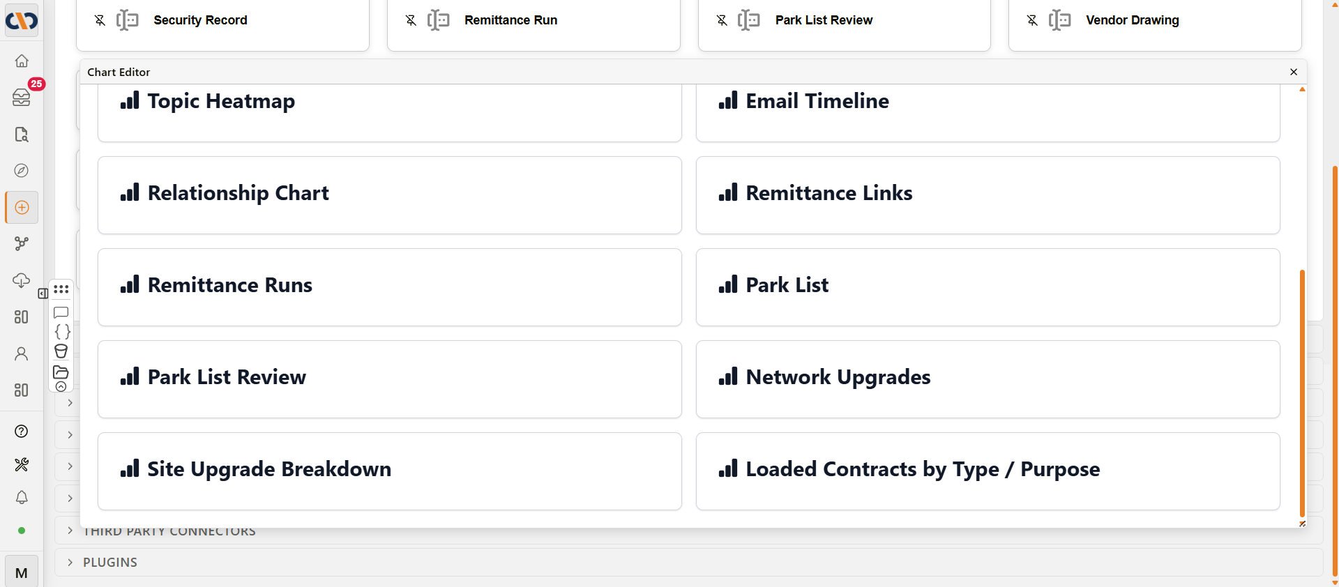
Chart Editor list
Chart Builder
Selecting a chart opens the Chart Builder. The interface has three panels: the DATA panel (left), the shelf and preview area (centre), and the FORMAT panel (right).
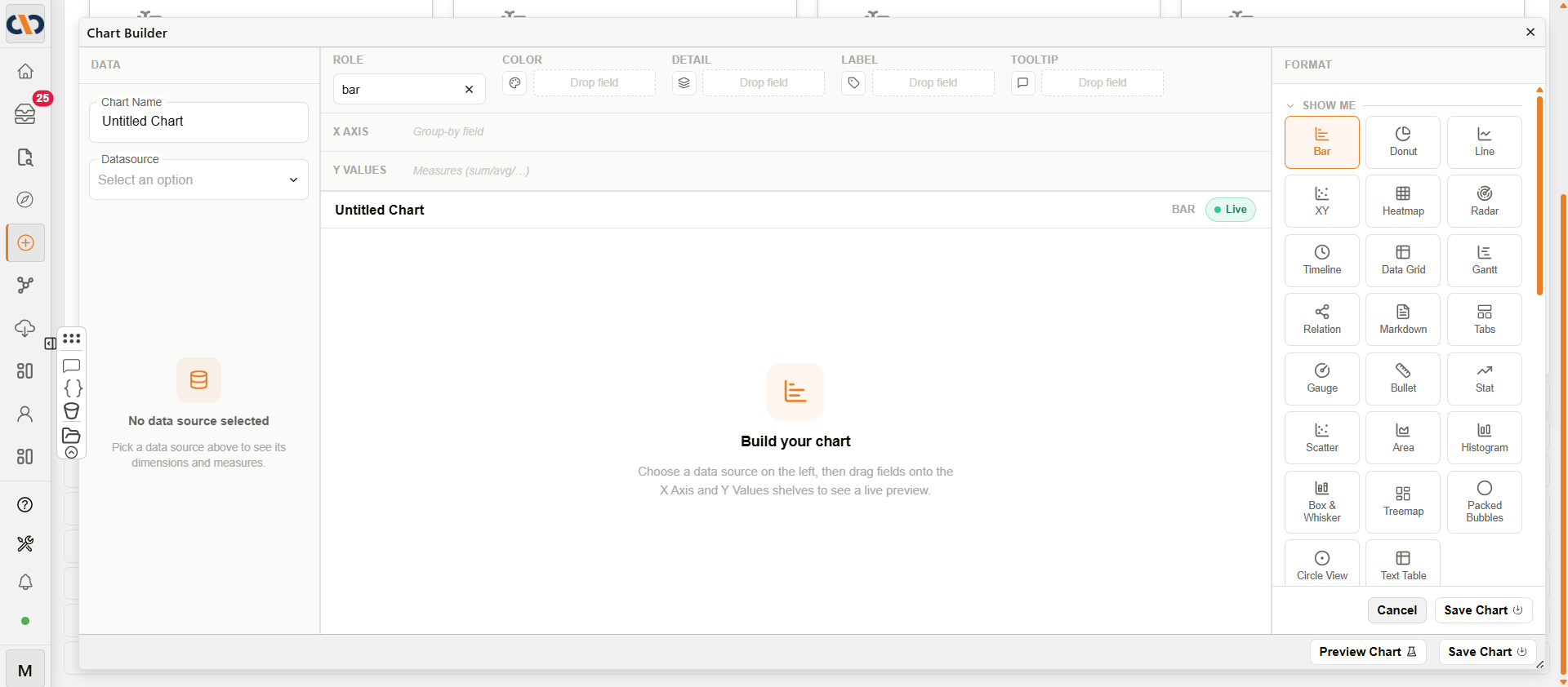
Chart Builder
DATA panel
The left panel is where you connect a datasource and browse the available fields.
| Field | Description |
|---|---|
| Chart Name | The name of the chart. |
| Datasource | The virtual datasource the chart draws from. Datasources are created in the Query Builder. Click the eye icon to view the datasource definition. |
| Search fields | Filters the list of dimensions and measures by name. Appears once a datasource is selected. |
| Dimensions | Text and date fields from the datasource. Drag these onto the shelves to group and categorise data. |
| Measures | Numeric fields and aggregations (e.g. Count). Drag these onto the shelves to calculate values. |
Shelf area
The centre-top section contains the shelves that control how fields map to the chart. The Role pill shows the active chart type. The available shelves change depending on the chart type selected in the SHOW ME panel.
| Shelf | Chart types | Description |
|---|---|---|
| X Axis | Bar, Line, Area, and similar | The dimension used to group data along the horizontal axis. |
| Y Values | Bar, Line, Area, and similar | The measure(s) plotted on the vertical axis. Supports aggregations (sum, avg, count, etc.). |
| Color | Most types | A field used to colour-code series or segments. |
| Detail | Most types | A field that adds granularity without creating a separate series. |
| Label | Most types | A field whose values appear as chart labels. |
| Tooltip | Most types | A field shown in hover tooltips. |
| Label/Series | Radar | The dimension that defines each axis on the radar. |
| Value | Radar | The measure plotted on each axis, with an aggregation selector (sum, avg, count, etc.). |
| Columns | Data Grid | The fields displayed as columns in the table. |
Chart preview
The centre area shows a live preview of the chart as fields are added to the shelves. A status bar above the preview displays the chart name, chart type, and a Live badge confirming the preview is connected to real data.
FORMAT panel
The right panel contains the chart type selector and formatting options.
SHOW ME
A grid of 25 chart type tiles. Clicking a tile switches the chart type immediately. The selected type is highlighted. Types recommended for the current field combination show a dot indicator. Types that require more fields than are currently placed are greyed out.
| Chart type | Description |
|---|---|
| Bar | Vertical or horizontal bars grouped by a dimension. |
| Donut | Circular chart showing proportional segments. |
| Line | Trend line across a continuous dimension. |
| XY | Scatter-style plot with explicit X and Y fields. |
| Heatmap | Grid of colour-coded cells showing value intensity. |
| Radar | Multi-axis polygon chart for comparing across categories. |
| Timeline | Gantt-style chart for date-ranged items. |
| Data Grid | Tabular view of data with sorting, filtering, and action rules. |
| Gantt | Project-style bar chart for scheduling and duration. |
| Kanban | Cards grouped into lanes, typically by a status-like field — a task-board view of records. |
| Relation | Node-link diagram for showing relationships between records. |
| Markdown | Free-text panel rendered as formatted markdown. |
| Tabs | Container that displays multiple charts in tab panels. |
| Gauge | Dial showing a single value against a target range. |
| Bullet | Compact bar with target and performance zones. |
| Stat | Single large metric value with optional comparison. |
| Scatter | Point chart showing the distribution of two measures. |
| Area | Filled line chart showing cumulative or stacked values. |
| Histogram | Frequency distribution across equal-width bins. |
| Box & Whisker | Statistical summary showing median, quartiles, and outliers. |
| Treemap | Hierarchical data shown as sized, nested rectangles. |
| Packed Bubbles | Values shown as area-proportional circles with grouping. |
| Circle View | Bubble layout with colour encoding and grouping. |
| Text Table | Crosstab table with cell colouring and totals. |
| Capacity | Horizontal bars showing used vs. total capacity per row, with configurable warning and alert thresholds. |
SETTINGS
Formatting options that vary by chart type.
Common options (most chart types):
| Option | Description |
|---|---|
| Layout | How multiple series are arranged (e.g. Grouped or Stacked). |
| Corner radius | Rounds the corners of bars. Range: 0–14 px. |
| Slice labels | Shows value or percentage labels on slices or segments. Options: None, Value, %. |
| Sort | Sort order for grouped results: High → Low, Low → High, or Data order. |
| Levels | Number of concentric rings on a Radar chart. Range: 3–10. |
| Palette | The colour scheme applied to the chart. Options: Docwize, Warm, Cool, Muted, Ocean, Earth, Vivid, Amber, Tide, Slate, Spectrum, Custom. |
Data Grid options:
| Option | Description |
|---|---|
| Colouring Rules | Apply background or text colour to cells based on conditions. |
| Formatting Rules | Format cell values (e.g. decimal places, date format). |
| Action Rules | Add buttons to rows that trigger a named action (e.g. open a linked chart or interface). |
| Drilldown Rules | Define what a row click navigates to. |
| Editing Rules | Allow users to edit specific fields inline. |
| Document Action Settings | Map columns to document ID, workflow ID, and other action parameters for row-level document actions. See fields below. |
| Data layer settings | Pin or hide specific columns. |
Document Action Settings fields:
| Field | Description |
|---|---|
| Document ID | The column that provides the document ID for row-level document actions. |
| Workflow ID | The column that provides the workflow ID, for rows linked to a workflow instance. |
| Workflow Item ID | The column that provides the workflow item ID. |
| Realtime workflow refresh | When enabled, rows linked to a workflow update automatically as the workflow progresses, without a manual refresh. Enabled by default. |
| Additional realtime workflow columns | Extra columns to keep in sync when Realtime workflow refresh is enabled. |
| Download Image_Name | The column that provides the filename used when a row's linked document is downloaded. |
Kanban options:
| Option | Description |
|---|---|
| Lanes | Configures the field that defines each lane. See fields below. |
| Cards | Configures which fields appear on each card. See fields below. |
| Appearance | Card density (default Normal), default lane width in pixels (default 280), and the colour palette. |
| Conditional Coloring | Add rules that colour cards based on field values. |
| Interaction Rules | Add rules that fire when a card is clicked, e.g. to drill down to a record. |
| Edit rules | Add rules that control which fields can be edited directly on a card. |
| Document actions | Maps a Document id column for row-level document actions, plus a Realtime refresh on workflow events toggle (enabled by default). |
Lanes fields:
| Field | Description |
|---|---|
| Lane field | The field that defines each lane — typically a status-like field. |
| Lane field kind | The type of field used for lanes (e.g. Custom field). |
| Swimlane field | Optional. A second field used to further group cards within each lane into swimlanes. |
| Show empty lanes | When enabled, lanes with no matching cards are still shown. Enabled by default. |
| Lane configuration | Add or reorder individual lanes via Add lane. |
Card fields:
| Field | Description |
|---|---|
| Card title field | The field shown as each card's title. |
| Card subtitle fields | Optional. Additional fields shown as subtitle text on each card. |
| Card badge fields | Optional. Fields shown as small badges on each card. |
| Editable card fields | Optional. Fields that can be edited directly on the card without opening the record. |
Timeline options:
| Field | Description |
|---|---|
| Category Keys | Optional field(s) used to group or colour entries. |
| Start Date Key | The field marking the start of each entry's date range. |
| End Date Key | The field marking the end of each entry's date range. |
| Event Key | Optional field for point-in-time events (as opposed to a range). |
| Preview Key | Optional field shown when previewing an entry. |
Markdown options:
| Field | Description |
|---|---|
| Template Editor | Opens a code editor to write the Markdown template that renders the chart's data. |
Capacity options:
| Option | Description |
|---|---|
| Remainder label | Label shown for the unused portion of each row's capacity. |
| Requested amount column | Optional. A column providing a requested amount, marked distinctly from the used amount. |
| Requested amount label | Label shown for the requested amount marker. |
| Reference marker (%) | A fixed percentage position to mark on each row as a reference line. |
| Reference column | Optional. A column providing a per-row reference value instead of a fixed percentage. |
| Sort rows | Row sort order. Default: Tightest first. |
| Max rows | Maximum number of rows displayed. Default: 12. |
| Warn at % left | Percentage of remaining capacity at which a row is flagged as a warning. Default: 25. |
| Alert at % left | Percentage of remaining capacity at which a row is flagged as an alert. Default: 10. |
| Show figures | When enabled, numeric values are shown on each bar. Enabled by default. |
| Palette | The colour scheme applied to the chart. Same options as Common options above. |
INTERACTIONS
Click interactions that fire when a user selects a data point on the chart. Use these to drill down to a related record or open a linked interface. The Timeline chart type calls the same feature Action Rules instead of Interactions — confirmed live, its options panel is labelled "Action Rules."
How to create a chart
| Step | Description |
|---|---|
| 1 | Navigate to New > Custom Fields & Configuration > Chart Builder. |
| 2 | Click Create New Chart. |
| 3 | Enter a Chart Name and select a Datasource from the dropdown. |
| 4 | Drag fields from Dimensions or Measures in the DATA panel onto the shelves in the centre area. |
| 5 | In the SHOW ME panel, select a chart type. Compatible types for the current fields are highlighted. |
| 6 | Adjust formatting options in the SETTINGS section as needed. |
| 7 | Click Preview Chart to review the output, then Save Chart. |
Locking a chart
A Lock chart button, next to Save Chart, prevents further edits to the chart's underlying data grid. Once locked, the button changes to Unlock chart; only unlocking (or saving to unlock) is permitted while the chart is locked.
Troubleshooting
| Issue | Detail |
|---|---|
| No datasources available | A virtual view must exist before a chart can be created. Create one in the Query Builder first. |
| Chart type is greyed out | The selected type requires more fields than are currently placed on the shelves. Add the necessary dimensions or measures first. |
| Preview shows "No results" | The datasource contains no data matching the current fields and filters. Check that the datasource has data and that all required filter values are set. |
| Chart shows no data after switching type | Some chart types require specific shelf configurations. Check which shelves the new type requires and place the appropriate fields. |
Related configuration
- Query Builder — creates the virtual views (datasources) that charts draw from
- Interface Builder — places charts in a virtual interface
- Interfaces — end-user instructions for opening and using interfaces