2026-06-22
リリースノート
新機能
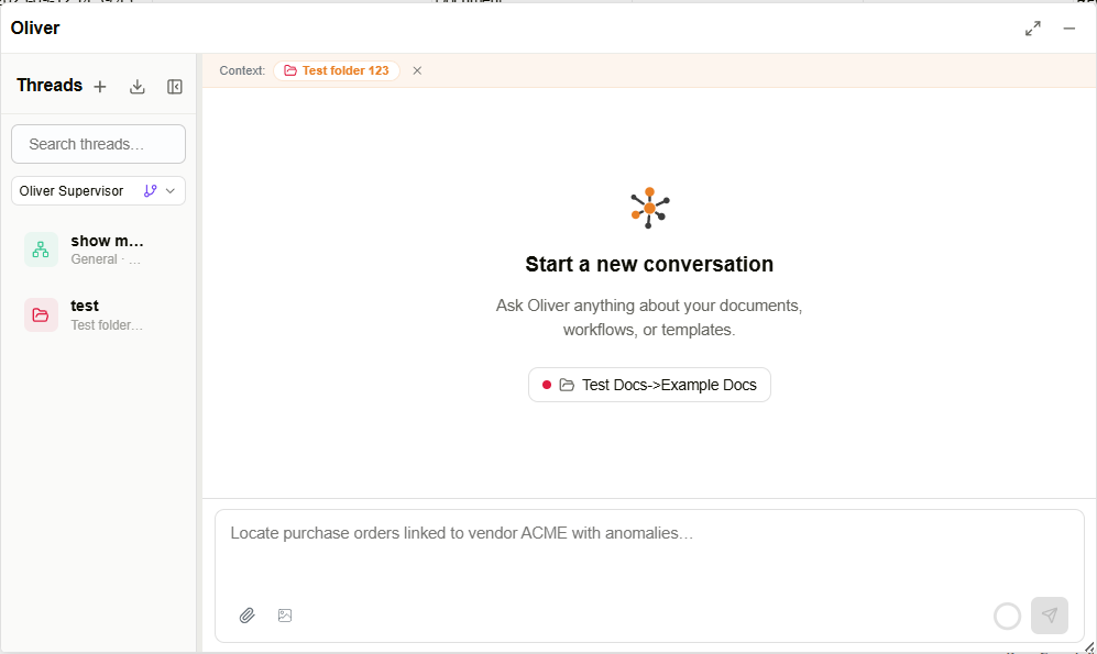
- AIアシスタントのOliverが、アプリセレクターおよびサイド��バーナビゲーションから全画面アプリケーションとして利用可能になりました。
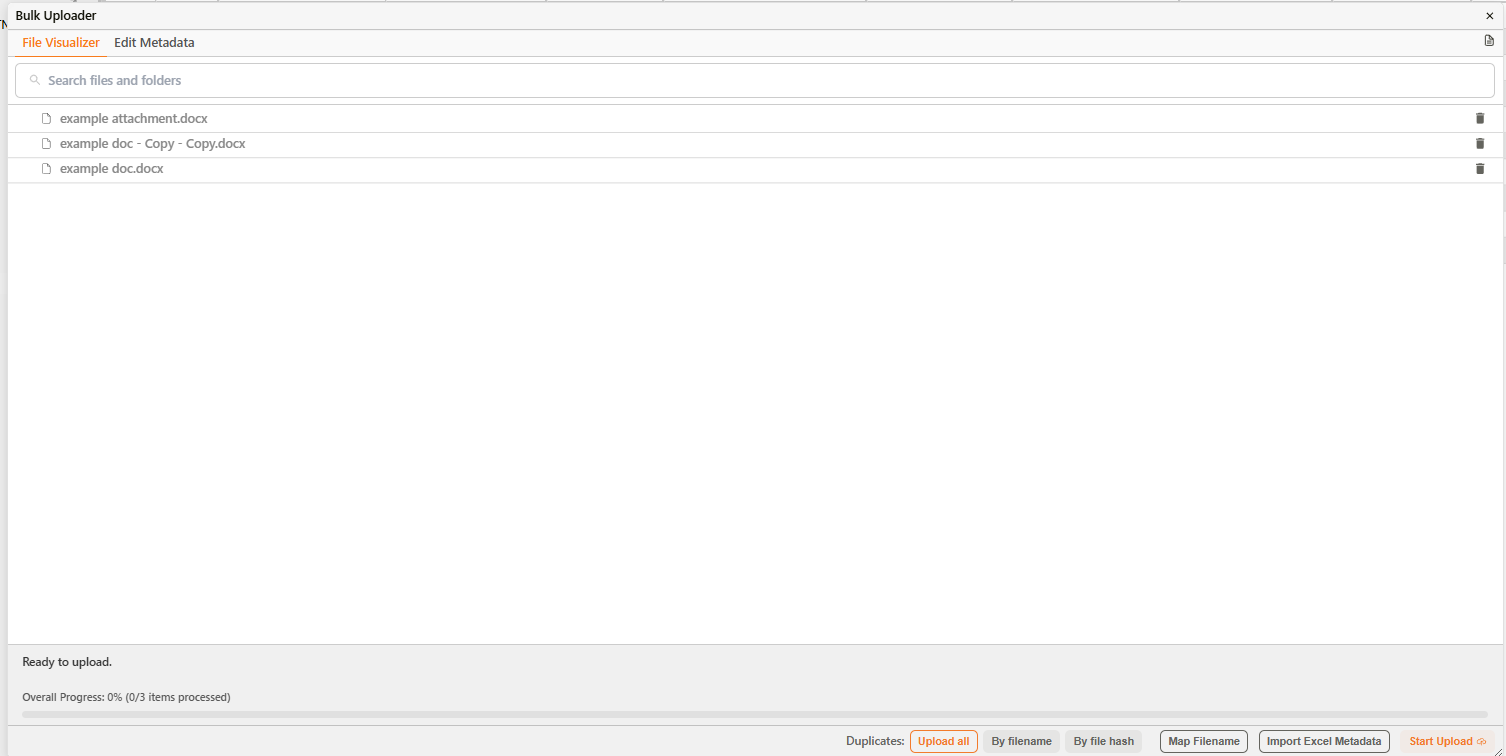
- 一括アップロードダイアログに重複処理セレクターが追加され、すべてのファイルをアップロードする、同名ファイルをスキップする、またはコンテンツハッシュが一致するファイルをスキップするオプションが選択可能になりました。
- エージェントのコンテキスト管理セクションに、圧縮バッファパーセンテージフィールドが追加されました。
- エージェントのモデルドロップダウンに「claude-opus-4-8」の選択肢が追加されました。
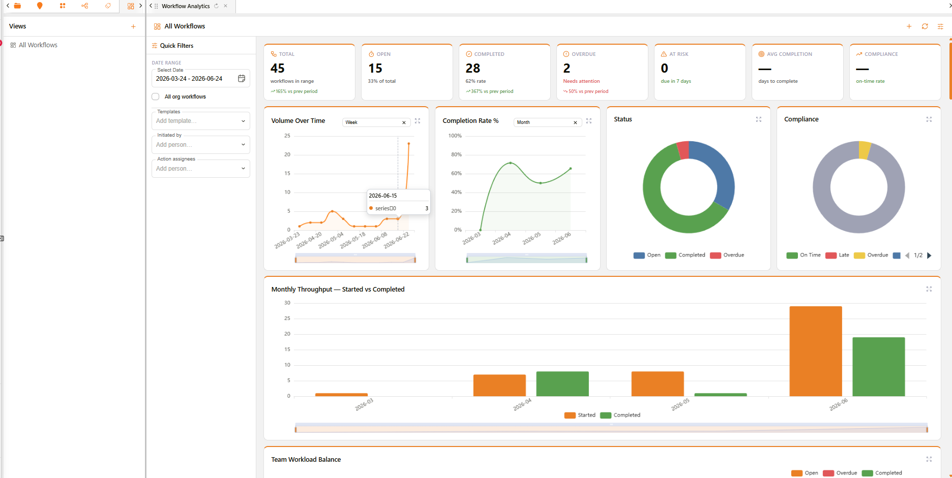
- チャートビルダーが再設計され、フィールドを「列 (Columns)」「行 (Rows)」「マーク (Marks)」のチャンネルに配置するためのドラッグ&ドロップ方式のシェルフインターフェースが導入されました。
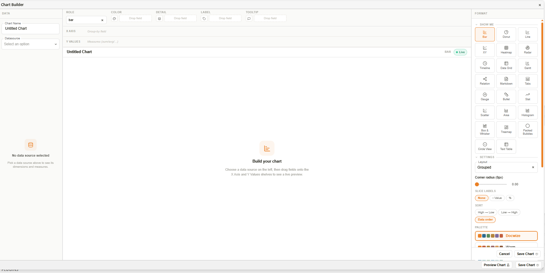
- マーク (Marks) カードが提供され、「色」「サイズ」「形状」「詳細」「ラベル」「ツールチップ」の各チャンネルを使用して、視覚的な特性をチャートにマッピングできるようになりました。
- 「Show Me」パネルに、配置されたフィールドに基づいて推奨または利用不可の状態を示すチャートタイプのタイルが表示されるようになりました。
- チャートプレビューの上部にあるステータスバーに、チャート名、選択されたチャートタイプ、およびライブインジケーターバッジが表示されるようになりました。
- フィールドを右クリックするとコンテキストメニューが開き、フィールドの役割(ディメンション/メジャー、不連続/連続)や日付の細度を変更できるようになりました。
- 追加のチャートタイプ(散布図、エリア、ヒストグラム、箱ひげ図、ツリーマップ、パックドバブル、サークルビュー、テキストテーブル)が利用可能になりました。
- チャートタイプセレクターがアイコンタイルの視覚的なグリッドとして表示され、推奨されるタイプがハイライトされるようになりました。
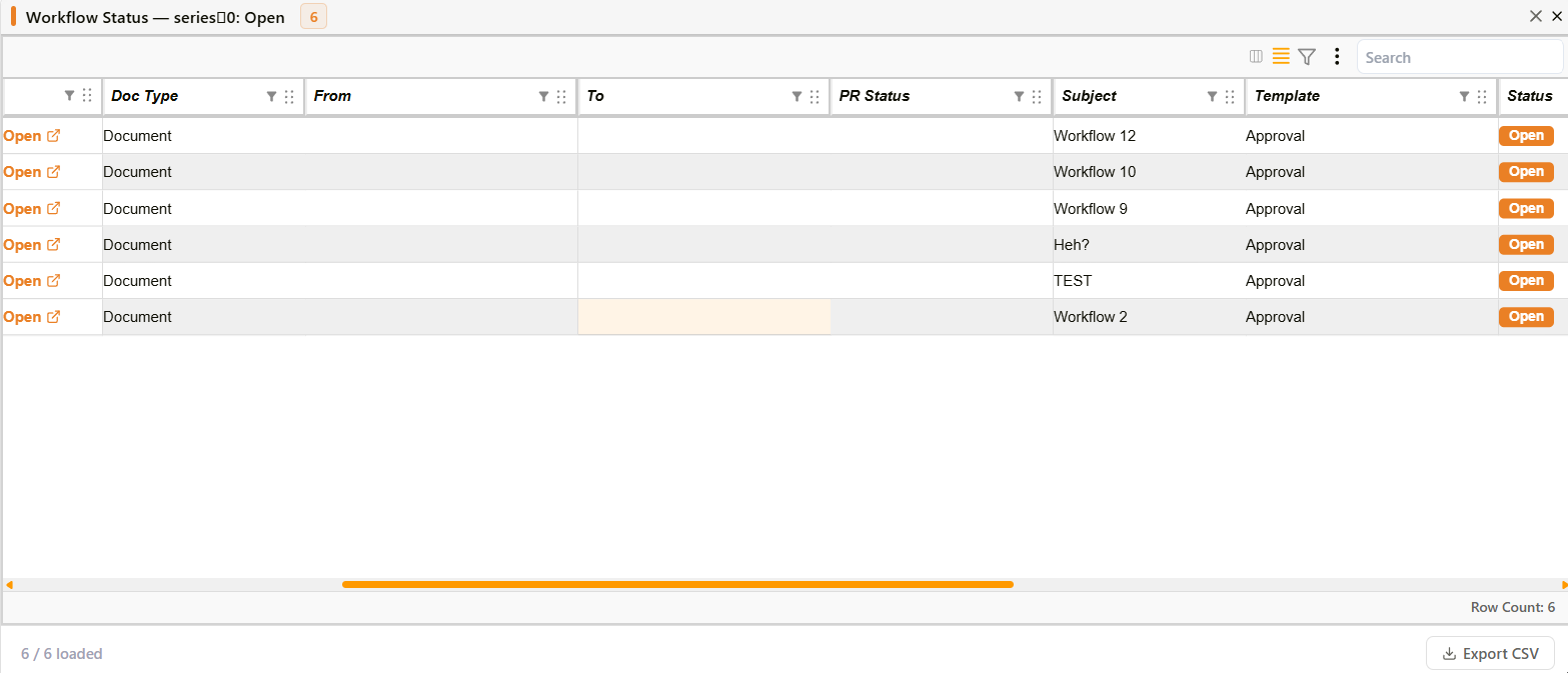
- チャートのデータポイントをクリックすると、検索可能でページ分割されたグリッドに基になるデータ行を表示するダイアログが開くようになりました。チャートにアクションが設定されている場合は、まず選択メニューが表示されます。
- キャンバスチャートに、シリーズ検索、シリーズごとの表示/非表示の切り替え、すべて表示/非表示、ホバーハイライト、および折りたたみオプションを備えた統合された凡例が表示されるようになりました。
- パレットピッカーにより、プリセットのカラーパレットから選択するか、カスタムカラーを定義できるようになりました。
- 連続色チャートに、最小値と最大値のラベルが付いたグラデーション凡例が表示されるようになりました。
- チャートに、チャート名とタイプを表示するタイトルヘッダーバーを表示できるようになりました。
- 棒グラフと折れ線グラフで、複数のメジャーを色分けされたシリーズとして表示できるようになりました。
- 折れ線グラフが右側のセカンダリY軸と塗りつぶしエリアレンダリングをサポートするようになりました。
- ドーナツグラフが、スライス上のラベル、スライスの角丸、センターディスク、引出線付きのエッジコールアウトラベル、およびパンくずリストパネルによるサブカテゴリへのドリルダウンをサポートするようになりました。
- ヒストグラムチャートが、等幅のビンにわたる頻度分布と、オプションの平均参照線を表示するようになりました。
- パックドバブルチャートが、値を面積比例の円として表示し、マルチレベルのグループ化、パン/ズームコントロール、およびビューリセットボタンをサポートするようになりました。
- クロス集計テキストテーブルチャートが、セルカラーモード、行と列の合計、小数点精度、およびヘッダーの固定をサポートするようになりました。
- ツリーマップチャートが、ディメンションでグループ化されたサイズ比例の長方形として階層データを表示するようになりました。
- ヒートマップチャートがカラースケール凡例を表示し、セルをクリックしてドリルダウンアクションを実行できるようになりました。
- レーダーチャートが、カスタムカラーパレット、クリックによるドリルダウン、および折りたたみ可能な凡例をサポートするようになりました。
- ガントチャートが切り替えコントロール付きのカラーリール凡例を表示するようになりました。
- 関係グラフに、ハブノードとリーフノードを区別する凡例が表示されるようになりました。
- レコードエディターで子レコードをリンクするための「サブレコード」セクションタイプが利用可能になりました。
- 「メタレコード」タイプが、子レコードのチェックボックスリストと、共有セクションのマージされたフォームを表示するようになりました。
改善点
- エージェント設定ダ�イアログのコンテキスト管理の上書き設定が、編集用に再オープンした際にも保持されるようになりました。
- コンテキスト使用量インジケーターに、予約された圧縮バッファが使用量バーの色付きバンドおよび独立した内訳行として表示されるようになりました。
- ワークフローの実行時入力選択ダイアログのレイアウトが再設計され、指示文、全幅セレクター、および選択カウント表示が追加されました。
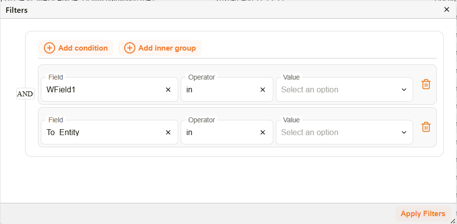
- ワークフローの条件ビルダーに、メールアドレス、電話番号、住所、カテゴリなどの受信者(To)連絡先フィールドが追加されました。
- フィルターエディターダイアログのフィルター行のスタイルが刷新され、選択箇所のハイライト改善、アイコン型の削除ボタン、および再設計された空の状態表示が追加されました。
- テキストフィールドで入力領域の末尾にアイコンを表示できるようになりました。
- チャートの空の状態に、アイコンと説明テキストが表示されるようになりました。
- チャートビルダーのデータペインに、検索フィールドとタイプを示すグリフとともにディメンションとメジャーが一覧表示されるようになりました。
- チャートビルダーのフォーマットペインで、チャートオプションが折りたたみ可能なセクションに整理されました。
- シェルフ上のメジャーフィールドに、集計関数(SUM, AVG, COUNT, MIN, MAX)のインラインセレクターが表示されるようになりました。
- ドーナツグラフの凡例に各項目の値とパーセンテージの割合が表示され、折りたたみ、一括切り替えオプション、およびホバーハイライトをサポートするようになりました。
- ガントチャートの色がプラットフォームのビジュアルテーマに合わせて更新されました。