Left Sidebar
The left sidebar provides users with a list of workflow tasks in their inbox. Its toolbar provides tools to filter the list, save filters as reusable views, and customize which fields are displayed.
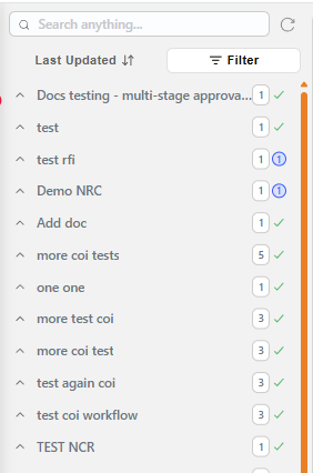
Example: Left Sidebar of Inbox
The sort and filter controls are labelled buttons (e.g. Last Updated, Filter) when there is enough width, and collapse to icon-only buttons on a narrower screen — both open the same panels.
| Field | Description |
|---|---|
| Search | Allows users to search for a key word/phrase within the names of workflow subjects and/or document names sent to workflows. |
| Sort & status control (↕ icon, or Last Updated when labelled) | Opens a panel to sort the list and quickly filter by status or date. See Sorting and quick filters below. |
| View & filters control (☰ icon, or Filter when labelled) | Opens a panel to select a saved view, build advanced filter conditions, and configure the display settings for the list. See Views and filters below. |
| Refresh | Refreshes the list of workflows in the inbox to the most up-to-date list. |
| Workflow task item | The arrow expands or contracts details of a particular workflow task. When expanded, a list of all the documents sent when the workflow task was initiated will appear. Blue icon: indicates that the action request(s) for the specified document have not been completed. Green tick: indicates that the action request(s) for the specified document have been completed. |
| (Varies) | The number shown next to the workflow subject line indicates how many documents were included when the workflow was initiated. |
Sorting and quick filters
Clicking the sort & status control opens a panel to control the sort order of the list and quickly narrow it by status or date, without building a full filter condition.
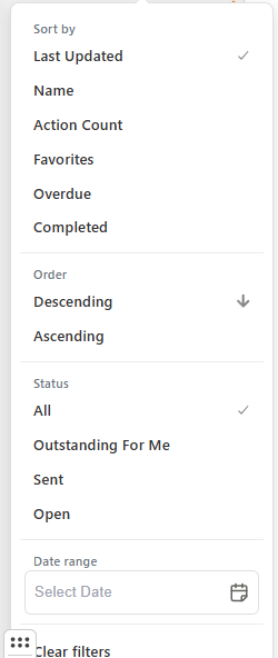
Example: Sorting and quick filters panel
| Field | Description |
|---|---|
| Sort by | Sorts the list by Last Updated, Name, Action Count, Favorites, Overdue, or Completed. |
| Order | Sets the sort direction: Descending or Ascending. |
| Status | Filters the list by All, Outstanding For Me, Sent, or Open. |
| Date range | Filters the list to items within a selected date range. |
| Clear filters | Removes all active selections in this panel. |
Views and filters
Clicking the view & filters control opens a panel with three parts: the current View, advanced Filters, and a link to configure the display.
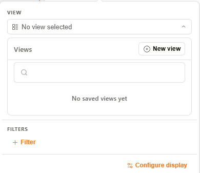
Example: Views and filters panel
| Section | Description |
|---|---|
| VIEW | Shows the currently selected view, or No view selected. Click it to expand the Views panel — see Views below. |
| FILTERS | Click + Filter to build an advanced filter condition — see Filtering the inbox list below. |
| Configure display | Opens the Display settings dialog — see Display settings below. |
Views
Users can save named filter configurations as reusable views, managed from the Views panel.
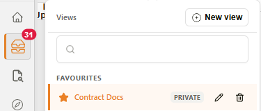
Example: Views panel
| Field | Description |
|---|---|
| New view | Opens the Create View dialog to build a new view from scratch. See Creating and editing views below. |
| Search | Filters the list of saved views by name. |
| Favourites | Group of views marked as favourites. |
| ★ (star icon) | Toggles whether a view is marked as a favourite. |
| Status badge | Indicates the visibility of the view: Private (the default — visible only to its creator), Shared (visible to specific users or groups), or Public (visible to all users). Set from the Sharing tab — see Creating and editing views below. When a view is set as the company default, this badge shows Company Default instead, regardless of the view's underlying Public/Private/Shared setting. |
| Company default (building icon) | Marks the view as the default for everyone in the organization — it opens automatically for users who have not chosen a view of their own. Marking a view as the company default also makes it Public. Clicking the icon again removes it as the company default, but the view remains Public afterward — it does not revert to its previous visibility. |
| Edit (pencil icon) | Opens the view in the Create View dialog for editing. |
| Delete (trash icon) | Deletes the view. |
Display settings
The Display settings dialog customizes which fields appear as sub-rows under each workflow and document entry in the list, for the current session.
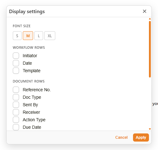
Example: Display settings dialog
| Field | Description |
|---|---|
| Font size | Sets the text size for the list: S, M, L, or XL. |
| Behaviour | Automatically open my next action — when checked, completing an action request automatically opens the next pending action in the list. Checked by default. |
| Workflow Rows | Checkboxes to show workflow-level fields as sub-rows: Initiator, Date, Template. |
| Document Rows | Checkboxes to show document-level fields as sub-rows: Reference No., Doc Type, Sent By, Receiver, Action Type, Due Date. |
| Custom Fields | Searchable list of custom fields, across all templates, that can be shown as sub-rows. |
| Cancel / Apply | Discards or applies the selected display settings. |
Filtering the inbox list
Clicking + Filter in the FILTERS section opens a builder for an advanced filter condition: a searchable field list, an operator (e.g. Equals, Contains, Begins With, Is Null, Is Not Null), and a value.
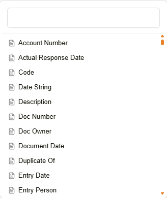
Example: Filter field selection
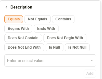
Example: Filter condition builder
For text fields, the value picker also lists a (blank) option alongside the field's real data values. Selecting it matches records where the field holds an empty string — this is distinct from the Is Null / Is Not Null operators, which test for no value at all.
A Reload options icon sits next to the value picker. Clicking it re-fetches the list of selectable values from the server, which is useful if a value was added or changed since the panel was opened.
Once a condition is added, it appears as a chip in the FILTERS section alongside further options:
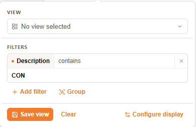
Example: Active filter
| Button | Description |
|---|---|
| Add filter | Adds a new condition row to the filter. |
| Group | Groups the current conditions, allowing more complex AND/OR logic. |
| Save view | Saves the current filter as a new view. Opens the Create View dialog, pre-filled with the current condition in the Query Parameters tab. See Creating and editing views below. |
| Clear | Removes all active conditions from the filter. |
Creating and editing views
Clicking New view in the Views panel, or Save view from an active filter, opens the Create View dialog. Existing views are edited from the same dialog, via the pencil icon in the Views panel. Every view has a name, an optional description, and four tabs.
| Tab | Description |
|---|---|
| Display Settings | The same field and font-size options as the standalone Display settings dialog, saved as part of this view. |
| Filters | Runtime inputs shown when the view is active — click Add dynamic filter to prompt users for a value each time the view is opened, rather than fixing it in the view itself. |
| Sharing | Sets who can see the view. |
| Query Parameters | Builds the view's filter conditions, using the same field/operator/value condition builder as Filtering the inbox list above — Add condition and Add inner group work the same way as Add filter and Group. Conditions are combined using AND logic by default. |
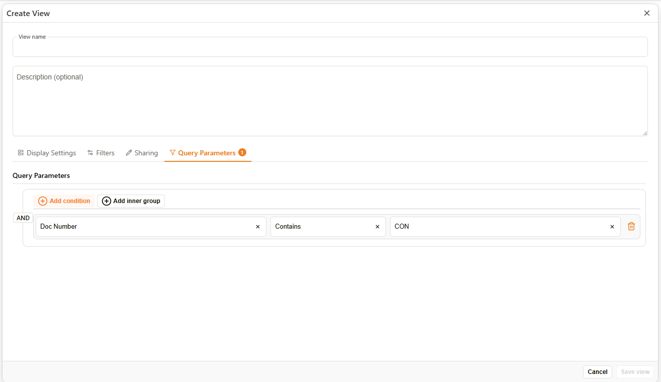
Example: Create View dialog — Query Parameters tab
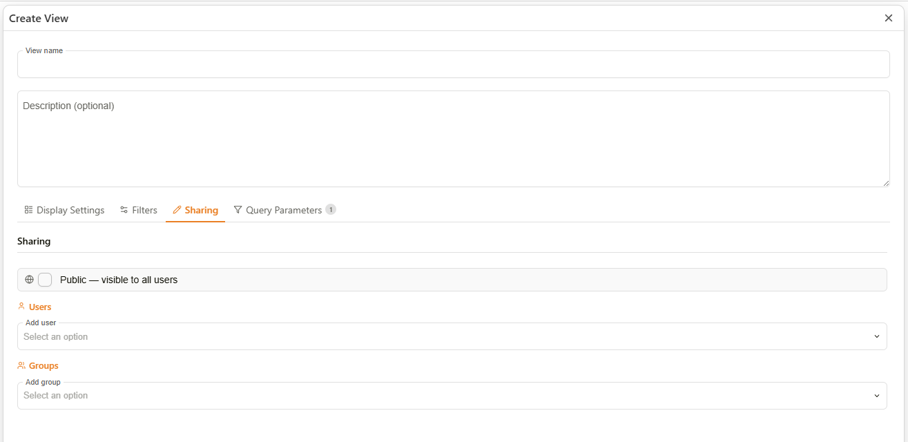
Example: Create View dialog — Sharing tab
| Field | Description |
|---|---|
| Public — visible to all users | When checked, the view is visible to every user. |
| Users | Add specific users the view should be shared with. |
| Groups | Add specific groups the view should be shared with. |
If Public is left unchecked and no users or groups are added, the view is Private and visible only to its creator.
A view's visibility can also be set to Public as a side effect of marking it the organization's default from the Views panel — see Company default (building icon) above.