Dataviews
A dataview is a configurable report that surfaces data from the Docwize database or external sources. Dataviews are accessed from the Dataviews and Interfaces tab in the Explorer sidebar. Each dataview opens as a tab in the main content area.
Dataviews can be configured to show editable columns, apply colour rules, and link to underlying documents via drilldowns. Custom dataviews are built using the Query Builder.
What you can do
- View and filter tabular data from the Docwize database or external sources
- Sort by one or more columns
- Search across visible columns
- Export data to Excel
- Drill down into underlying documents
Opening a dataview
In Explorer, switch to the Dataviews and Interfaces tab. Dataviews are listed under named groups. Click the arrow-out icon (↗) next to a dataview name to open it as a tab.
Dataview toolbar
When a dataview is open, the following controls appear:
| Control | Description |
|---|---|
| Export | Exports the dataview data. |
| Inspect Workflows | For dataviews built on documents that participate in workflows, opens a register of every workflow task tied to the dataview's rows — including the workflow and template IDs, subject, creator, entry date, task type, status, and any error. Offers All or Selected rows as the scope. Includes a Bulk Retry button for re-running failed workflow tasks in bulk. Viewing the register doesn't change the underlying documents or their workflow state. |
| Detach Previews | Opens document previews in a separate window instead of the docked preview panel. See Detach Previews for what a detached window lets you do. |
| Grid view icon | Switches the dataview to a compact grid layout. |
| List view icon | Switches the dataview to a list layout. |
| Filter icon | Opens the filter panel for the dataview. |
| ⋮ (more options) | Opens a menu with additional options. Currently includes Export to Excel. |
| Search | Filters rows by keyword across visible columns. |
Pre-filtered dataviews
A dataview's underlying query can include conditions that are built in by whoever configured it — for example, a dataview that only ever shows documents from one specific project or with a particular status. These built-in conditions apply automatically every time the dataview is opened, and can't be removed by the user viewing it.
This is different from the interactive Filter icon and column filters described above, which the user controls and can change or clear at any time. A dataview may combine both: a fixed, built-in scope set by its configuration, narrowed further by whatever the user filters on top of it. For how these built-in conditions are configured, see the Conditions tab in Query Builder.
Column headers
Each column header shows the column name and two controls:
| Control | Description |
|---|---|
| ▼ (filter icon) | Opens a filter for that column. |
| :: (sort icon) | Sorts the dataview by that column. Click once for ascending, click again for descending. Hold Shift and click a second column header to sort by multiple columns simultaneously. |
Rows
Each row in a dataview shows:
| Element | Description |
|---|---|
| :: (drag handle) | Appears on the left of each row. |
| Checkbox | Selects the row. Use row checkboxes for multi-select actions. |
| Document type icon | Shows the file type of the linked document (for example, PDF or Word). |
| Data cells | The values for each configured column. |
| Orange link (drilldown) | Where configured, clicking an orange number or link opens a filtered view of the underlying documents for that row. |
Row count is shown at the bottom right of the dataview and reflects the total number of rows returned.
Drilldowns
Dataviews can be configured to allow users to drill into underlying documents. Where a column contains an orange link (typically a number), clicking it opens a filtered view of the documents that contribute to that value.
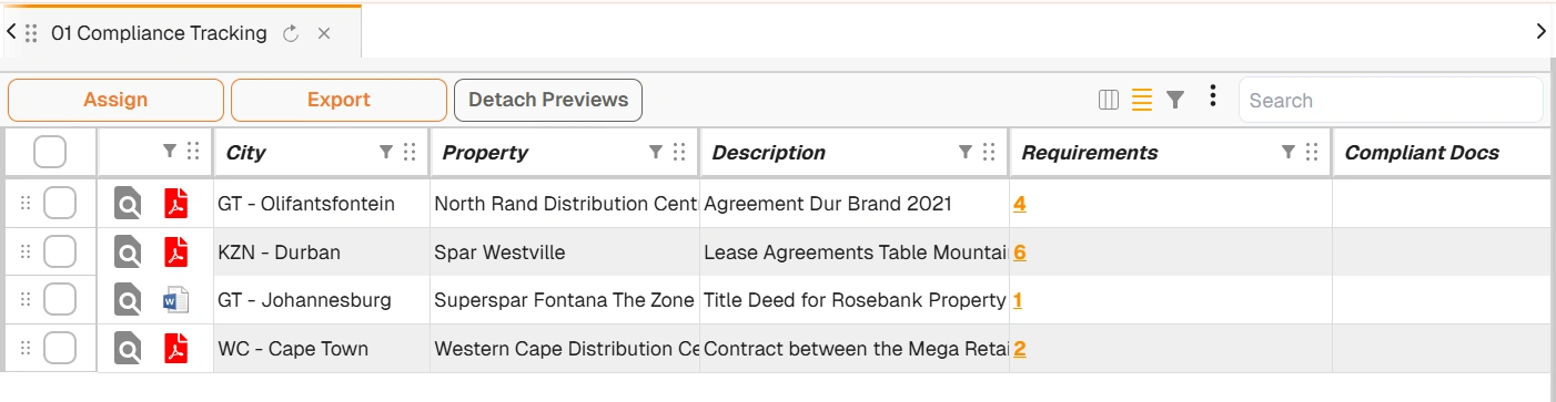
Example: dataview with drilldown links
Dataview settings
Users with the appropriate permissions can access dataview settings via the gear icon (⚙) next to the dataview name in the Explorer sidebar, or within the dataview itself.
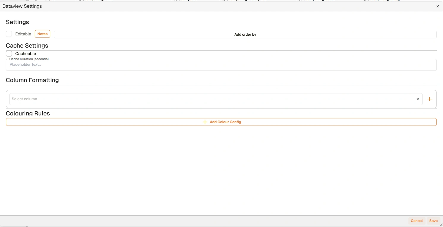
Dataview Settings dialog
| Category | Setting | Description |
|---|---|---|
| Settings | Notes | Adds a description to the dataview — for example, its purpose or when it was created. |
| Add Order By | Configures default sort order (ascending or descending on a specified field). | |
| Cache Settings | Sets whether the dataview is cacheable, and the cache duration in seconds. | |
| Column Formatting | Customises column display. Click + to add formatting rules. | |
| Coloring Rules | Applies colour coding based on conditions — for example, Status = Complete shows green. Click Add Color Config to create a rule. |
Pinning a dataview to the homepage
The pin icon at the top right of the Dataview settings dialog opens a separate Pin to homepage panel, letting a user add a shortcut to a dataview on their own homepage — distinct from an administrator embedding a dataview grid via Manage Homepage.
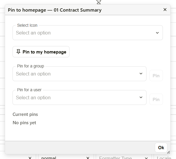
Pin to homepage panel
| Field | Description |
|---|---|
| Select Icon | Searchable list of icons to represent the dataview's shortcut tile. |
| Pin to my homepage | Pins the dataview to the current user's own homepage. Toggles to Unpin from my homepage once pinned. |
| Pin for a group | Pins the dataview to the homepage of every user in a selected group. |
| Pin for a user | Pins the dataview to a specific user's homepage. |
| Current pins | Lists each active pin with who pinned it, and an × to remove it. |
A pinned dataview appears as an additional tile at the end of the module grid on the homepage, and as a shortcut button in the main navigation. Clicking it opens the dataview directly.
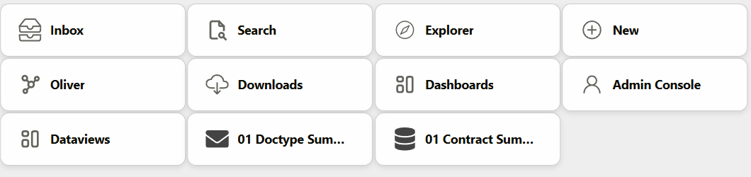
Two pinned dataview tiles on the homepage
Creating dataviews
Dataviews are built by administrators using the Query Builder.
Related pages
- Explorer — overview of the Explorer module
- Interfaces — multi-component views that can include dataview-style grids alongside charts
- Query Builder — how administrators build and configure dataviews