Analytics
Analytics is accessed from the Explorer toolbar and opens as a dashboard tab, giving users a visual overview of key metrics and trends — summary tiles and charts — instead of a document-by-document list.
What you can do in Analytics
- View key metrics at a glance via summary tiles
- Explore trends over time using charts
- Filter the dashboard using relevant fields for the data being shown
- Save filter combinations as named views
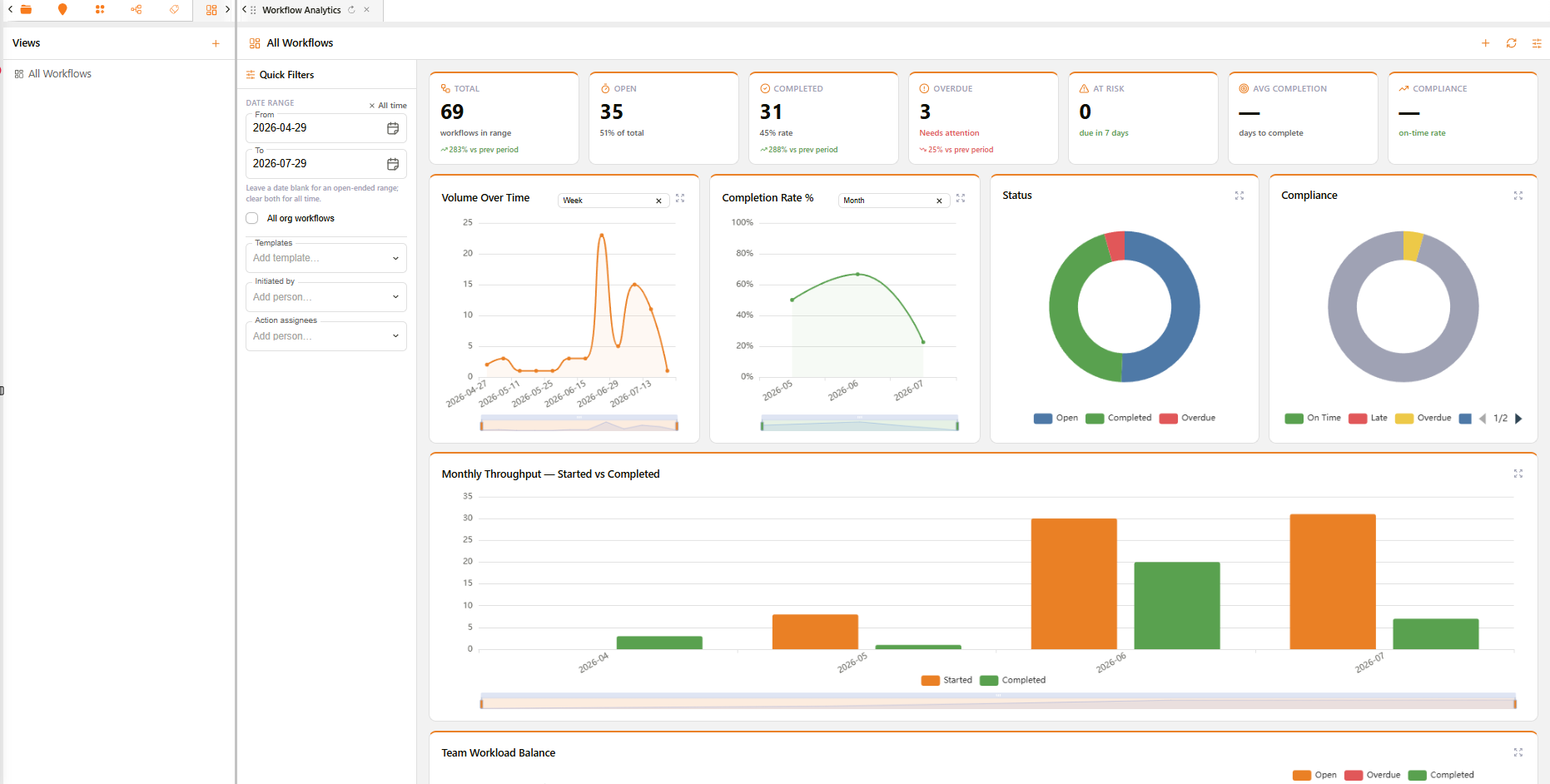
Example: Workflow Analytics dashboard
Dashboard overview
Analytics can surface different dashboards depending on what is being analysed. One example is Workflow Analytics, shown above, which gives a detailed breakdown of workflow performance, well beyond the seven headline tiles:
- Volume and trend charts — Volume Over Time, Completion Rate %, Status, Compliance, and Monthly Throughput (Started vs Completed) over the selected date range.
- Team and workload charts — Team Workload Balance, Workflows by Template, Top Initiators, Open Actions by Assignee, and Overdue Actions.
- Timing and bottleneck charts — Bottleneck Analysis, Avg Completion Time, Avg Action Response Time, Workflow Age, Task Status, Reply Distribution, an Activity Heatmap (day × hour), SLA Breach Trend, and First Response Time.
- Distribution charts — Cancelled vs Active Workflows, Delegation Rate by Template, and Action Type Distribution.
- Section-level charts (based on workflow section labels) — Section Workload, Section Open vs Overdue, Section Completion Rate, Section Avg Response Time, Pipeline Duration, and Section On-Time Rate.
- Where Workflows Are Stuck — a row of small charts showing where each template's workflows are currently held up.
- Workflow Timeline — a Gantt-style view of workflow activity grouped by template.
- Summary tables — Template Summary, Section Performance, and Assignee Workload, each an interactive, sortable register rather than a static chart.
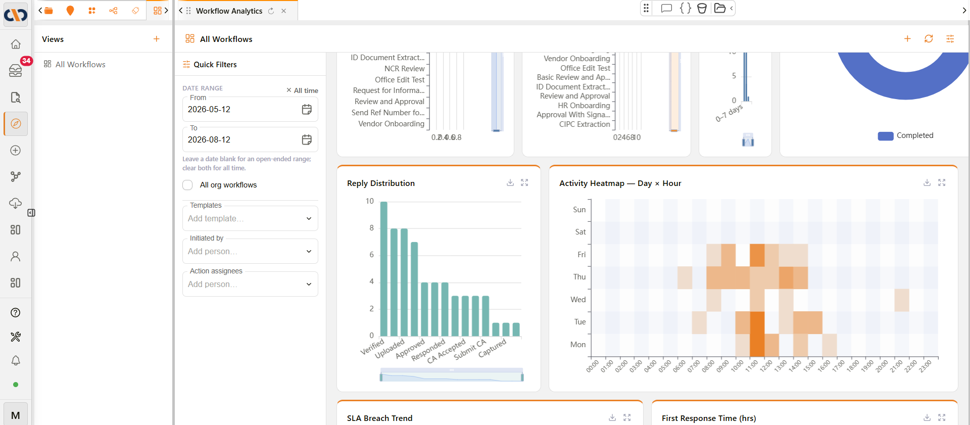
Example: Reply Distribution and Activity Heatmap charts
Views and filters
The Views panel on the left lists saved dashboard configurations — for the Workflow Analytics example, the default All Workflows view. The Quick Filters panel lets users narrow the dashboard using fields relevant to the data being shown (for workflows, this includes date range, template, initiator, and action assignee). Once a useful filter combination is set up, it can be saved as a new named view (via the + button in the Views panel) so it can be reopened later without rebuilding the filters each time.
A refresh icon in the top-right corner of the dashboard reloads all of its charts and tiles with current data on demand.
Chart controls
Each chart on a dashboard has two controls in its top-right corner:
| Control | Description |
|---|---|
| Download as Excel | Downloads that chart's underlying data as an Excel file. |
| Expand chart | Opens the chart in a larger view, with its own Export to Excel button. |
Separately from the top-right corner icons, some charts show a grouping selector within their own header. On Avg Action Response Time, for example, it defaults to "Template" and can be changed to Assignee, Creator, Document Type, or one of the Cost Codes fields (Description, Cost code, Department, HOD). Grouping options are chart-specific and have not been confirmed for every chart on the dashboard.